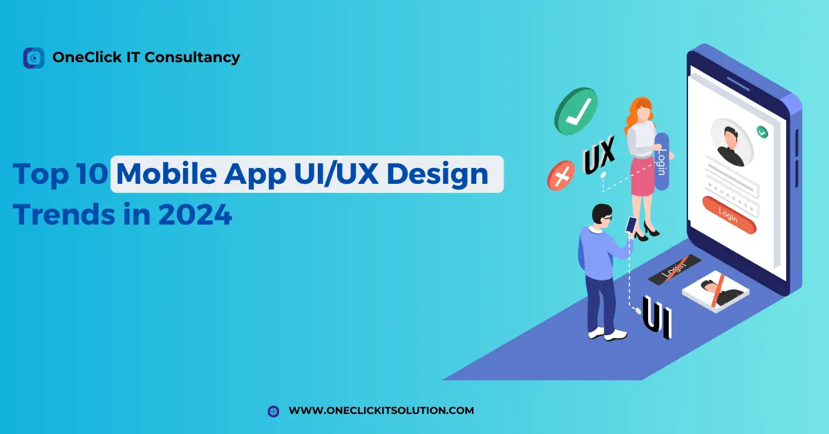
Top 10 Mobile App UI/UX Design Trends in 2024
Introduction
In this world where changes are the new constant there are a huge variety of mobile apps depending on the compliance with the design principles and the landscape full of constantly changing UI/UX principles. In this context of 2024, where wind is the metaphor for technology innovation, the current mobile app UI/UX design now has the effects of some very significant trends and transformation waves.
Here we will show 10 major Mobile App UI/UX Design Trends for 2024 that will rule in the mobile apps design in UI/UX in 2024. By using the waves of innovation, centred-on-users, and adopting user personalization seamlessly in our design, along with the best practices in minimalism, UI/UX designers and app developers are led through this way.
Explore with us on an expedition through a chain of artistic discovery and identifying the impact of modifications for UI/UX design for mobile apps in 2024. Together, let us set foot on the way that is all about innovation, and user-experience comes first in the new and thrilling mobile app designing realm.
What is UI and What is UX?
To understand what is UI/UX design in simple words UI (User Interface) and UX (User Experience) are 2 concepts which are very closely related in the domain of design and they can usually be found in digital products such as websites, mobile apps and software interfaces. Although they are related in terms of the design process, they represent different views of the usage context.
What is User Interface (UI):
UI/UX Design of Chatbots plays an important role in building conversational interfaces which are both intuitive and more entertaining. The most important part of the whole design process is Natural Language Processing (NLP) algorithms that empower chatbots with the ability to take and make answers in a human-like way. UI design focuses on building an interface that is user friendly, beautiful and straightforward during usage so that users can easily maneuver the product and achieve their goals in the process. UI designers, on the other hand, will be responsible for knowing the users’ needs, behaviours, and preferences. They, in turn, will create services and products that are easy to use and pleasant-looking.
What is User Experience (UX):
UX goes through all the phases of the interactions users have with a digital product, from the moment they see the product until they finish all their tasks. It combines it with visual interface as well as different aspects like usability, accessibility, ease of navigation, responsiveness, and emotional response. UX design aims at recognizing user needs, actions, and preferences to develop relevant and pleasing experiences that solve user goals and stimulate engagement. UX designers perform research, user testing and iterative design processes to ultimately make the product user friendly and meet client expectations and give value for the money.
In fact, UI and UX can be considered two sides of one and the same coin when it comes to the digital product design. While UI deals with the way the UI looks and is displayed, UX digs deeper into the overall user experience and ensures that each interaction is easy, smooth, and unforgettable. At the same time, both UI & UX designer work hand in glove to come up with products that look good and achieve ease of use as well as user satisfaction.

10 Mobile App UI/UX Design Trends:
We will showcase here the latest trends in ui ux design which has the potential to be a hit in 2024
1) Minimalism
Minimizing design in a mobile application represents the idea of simplicity, clarity, and ease of use, so designers try to reduce the elements that make it complicated via elimination only what is not necessary. It takes away everything distracts, centers around important things and, eventually, makes a more user-friendly product. This design approach includes many components, such as how things are placed, the types of typography, and colors, and the interactions.
On the other hand, the essence of minimalist mobile apps lies in the simple approach that offers stripped-down interfaces with a single purpose (straightforward navigation and clear comprehension). They eliminate the distracting decorative elements and replace these with purpose-oriented functions, which ensures a smooth interaction of users with the app. This minimalism goes right to the whitespace (negative space) usage which is supposed to create some balance, harmony as well as visual hierarchy. Whitespace functions as a cognitive refresher and aids in highlighting essential components of the screen, resulting in better usability overall.
Typography being a principal feature of minimalism reserved for the use of neat and catchy fonts for their contemporary and simple look. The absence of serifs is usually used to create a uniformity for the fonts on different devices. Apart from that, the complete absence of apps will bring out usage of minimal color combinations. This simple color use is the reason behind the creation of a stylistic identity without compromising the classy looking.
Image Souce: dribble
2) Advanced Personalization
Advanced personalization of mobile app design is a skillful strategy which aims to make user experience different while matching individual preferences, behaviors, and demographics. This strategy is mainly based on tons of data collection and analysis which covers many customer relations, demographics and past behaviors. Through the use of machine learning algorithms and predictive analytics, mobile apps generate unique user profiles for each user to understand the individual’s specific needs and wants. By monitoring user behavior within the app and beyond, the advanced personalization makes the apps deliver to their users highly customized content, recommendations and offers in a real-time way, which increases user engagement and personal satisfaction.
In the center of the most sophisticated personalization there is a process of dynamic content delivery and context awareness. Mobile apps utilize the context based coordinating factors like location, time of day, device type, and user context to provide users with hyper specific experiences. This approach would allow for provision of personalized content, promotions and features that will satisfy the user’s current short term needs and preferences.
Additionally, predictive analytics algorithms give the apps the ability to forecast user behavior and preferences, allowing for an active personalization of experiences fitting the users’ needs. In general, complex personalization gives mobile applications an ability to create customized experiences that result in user engagement, brand loyalty, and finally, businesses’ success.
Image Source: Medium
3) Chatbots UI UX Design
The UI/UX design of the chatbots highly influences the affairs of making interaction simple and fun. Natural Language Processing (NLP) algorithms are the ones that make up the architectural design and help to interpret questions and answers in a natural way. A well-built UI encourages users to have a conversation with the chatbot using natural language and a clear and well-informed messaging that directs the users to proceed through the interaction process.
Furthermore, the conversational structure is carefully arranged for the flow of discussion with the intuitive prompts and replies, allowing a natural and entertaining interaction between the user and the chatbot.
Besides, chatbot UI/UX design makes the importance of personalization to elevate user engagement. By personalizing their responses and suggestions based on users’ tastes and historical interactions chatbots can provide much more relevant and meaningful solutions. Personalized communications not only invoke the feeling of understanding, but also create the bond between the user and the chatbot, which in turn, results in more satisfaction and loyalty. In conclusion, good UI/UX design is the key to accomplishing the main goal of a chatbot: helpfulness, giving answers and providing useful info.
Image Source: Uxness
4) Dark Mode
Dark mode, the latest design trend across many digital platforms, provides both aesthetic value and practical advantages. With a shift of the light color scheme to the darker color scheme, dark mode reduces the eye strain, particularly in the low-light environments, making it easier to view the content for a long time without any discomfort. This design decision increases readability, especially for these light-sensitive and visually impaired users, by providing excellent contrast between white text and black backgrounds.
Also, dark mode supports energy efficiency, notably OLED and AMOLED screens as they use minimal energy as compared to light mode. This may, in turn, improve the battery life, thus keeping the usage time of mobile devices long and making it unnecessary to recharge the device frequently. Moreover, dark mode makes the user experience more vivid, especially in the case of multimedia applications where dark backgrounds increase the visibility and the effect of visuals. In general, dark mode is about a comfortable viewing and has become a much-needed feature of mobile apps and websites that leads many designers and developers to include it in their design strategies.
Image Source: Medium
5) Glassmorphism
Glassmorphic style has grown to be an exciting design trend in the ui ux design, fascinating the designers with its nice and current feel and playing a key role in the ui ux design app as well . By means of the use of translucent or semi-transparent objects, such as glass, this approach provides a sense of realism and depth of digital interfaces. Using translucent areas and slightly darkened parts, glassmorphism endows a layered structure to the interface creating a lively and visually appealing design.
Furthermore, glassmorphism wanders between the fantastic and ordinary by being complex but maintaining tidiness through the employment of subtle visual effects. This mixture of transparency, minimalism and dept makes the interfaces more appealing while it makes them more engaging for the users to be immersed in them. Therefore, glassmorphism has grown in popularity as it is aimed at designers who are looking for an easy way to create modern and visually engaging UIs that keep users focused and engaged.
Image Source: Medium
6) Augmented Reality(AR) / Virtual Reality (VR)
AR and VR are cutting-edge technologies that have forever altered user experiences in different realms like gaming, learning, healthcare, or retail and display an important part of the ui/ux design for mobile apps. AR superimposes virtual items onto the actual world around us, thereby empowering the observer’s perception and interaction with the environment. On the other hand, VR immerses players into a completely artificial reality in which they experience the physical presence and even participate in virtual spaces. On the other hand, AR and VR both technologies show a great capacity for making user interfaces and experiences engaging.
The use of AR and VR in the user interface space introduces new interaction and storytelling means. Through AR displays, one can have instant data access superimposed on physical objects. This improves one’s comprehension and interaction with the real world. VR, however, lets users navigate in virtual interfaces that, unlike in the real world, allow them to interact with objects, visit other worlds, and experience content by different means than in the physical world. AR as well as VR interface construction demands attention to spatial design, user interactions, and immersive storytelling techniques; otherwise, users might be bored with experiences that utilize ineffective design. With advanced AR and VR technologies that are constantly evolving, the way of UI design is being reshaped, opening up previously unseen opportunities for creativity and innovation.
Image Source: Medium
7) Voice User Interface
Voice User Interface (VUI) technology changed the way people communicate with digital systems by allowing spoken commands/natural language to handle products or seek information. VUIs are very popular and are increasingly used by virtual assistants like Amazon’s Alexa and Google’s Assistant. They offer a lot of conveniences including that the user does not have to use their hand to perform tasks such as setting a reminder, playing music or checking the weather because all these can be done by the user just by speaking. Compared to the VUI that is able to achieve optimal speech recognition accuracy, understand the natural language nuances, and develop intuitive conversational flows; users will get clarity and attain seamless interactions.
One of the important aspects in designing a VUI is to create a voice interface that is simple, interactive and allows users to perform multiple tasks effectively. Using speech recognition and conversational design elements, designers can develop VUIs that provide an easy and natural way for the users to interact with devices and platforms, ultimately increasing usability and accessibility. As VUI technology goes through transformation and development, it provides a new paradigm of users’ interaction with digital systems via voice commands and conversation media, which deliver more natural and efficient methods to connect with the technology.
Image Source: Ramotion
8) User-Generated Design
User-generated design is when both app UI/UX designers and the wide community of their users who want to participate in the entire UI/UX design work together in defining the framework of digital products. UI/UX designers can elicit active participation from users via crowdsourcing platforms and open collaboration tools. In this case, users are able to express their valuable ideas, feedback, and content that is used to improve the user experience. This collaborative approach covers more than the typical design cycles, using the pool of knowledge and imagination of the users to adjust the UI / UX design elements and to make them appropriate to the needs and preferences of the target audience.
Organizations that deal in UI/UX design stand to benefit from user-generated design as it provides them with the intricate dryads of users and their points of view. To involve users in the design process looks like a good strategy for UI/UX designers, as they can get more information on user behavior, preferences, and pains, through that design process. It finally helps UI/UX designers to generate more intuitive and friendly designs. User-generated design further encourages users to own the design process, which in turn results in engagement among users because they are an integral part of the design of products they make use of. The use of this cooperative work style not only increases the quality of a User Interface but also helps with user satisfaction and loyalty, contributing directly to the success of digital services and products.
9) Neumorphism
In the space of mobile apps UI/UX design, Neumorphism is an emerging trend destined to become a prominent factor in 2024. Our forecast for 2024 among the UI/UX design trends, neumorphic style perfectly fits with minimalism style and at the same time looks like real lifelike objects. In this design technique for mobile app UI/UX, soft and pillowy shadows and lowlights are used to make the button, cards, and input fields look more soft. Neumorphism can be seen as a harmonization of style and functions whereby the visually pleasing interface yet user-friendly UI gives an experience fitting to the perception of mobile app users.
Developers trying to convey neumorphism in the field of UI/UX design for mobile apps have to land in the grey zones of realism and minimalism and making sure the apps are usable and accessible. The interface design elements typical to neumorphism, which are soft, further intensify the interactivity of mobile apps, drawing in users by way of the responsive and tactile nature of the interface. Through the incorporation of neumorphism as a part of the research landscape for mobile apps in 2024, designers may design visually compelling and user-friendly interfaces that can boost mobile apps’ user experience to exceptional level.
Image Source: Just in Time
10) Bottom Navigation
Bottom navigation is generally a design technique employed in mobile applications where the navigation choices are at the bottom of the screen. This way of designing the current layout provides easy access to the main app functionality and destinations, offering convenience of transition between various parts of the app. The bottom navigation panel usually features a row of logos or labels along the bottom edge of the screen, which allows users to effortlessly tap on the buttons to navigate the primary functions of the app.
One of the strong points of a bottom navigation is its ergonomic design, because users may control the navigation screen with their thumb’s, which is beneficial on bigger smartphones and convenient for one-handed use. Moreover, the bottom navigation allows the user to gain access to core functions of the app from all screens and this results in increased ease of use and high end user experience. Designers developing applications would often implement bottom navigation alongside other navigation panels like tab bars or side menus to achieve a convenient and intuitive navigation for users. Generally, bottom navigation is a popular UI design approach for mobile apps that gives users quick access and what they need especially.
Image Source: Medium
Conclusion
In this sense the digital world, the combination of topical trends and basic principles form the bedrock for development of digital experiences. UI (User Interface) and UX (User Experience) are fundamental design elements that generate interactive and user friendly mobile app interfaces that are appealing to the users. It is clear that the trends we discussed in the 10 mobile app UI/UX design trends in 2024 are not for one specific purpose but rather enhance the general usability, functionality, and aesthetics in a differentiated manner.
From the timeless grace of minimalism to the immersive capabilities of AR/VR, they present an innovative set of tools and techniques that are at the designers’ disposal for them to convey a really engaging message. The dark mode and glassmorphism of our design enables an eye-catching visual impression while achieving better readability and reducing eye strain as well, fulfilling the taste of our audience and improving access for users less sensitive.
Moreover, the surge of user-generated design labels stimulates the involvement of the users in the design process that leads to the feeling of ownership and community which in turn spurred innovation.
Additionally, neumorphism applies a new dimension to the design of UIs, which integrates minimalism with soft forms of elements to create beautiful and attractive interfaces. The bottom navigation menu and voice user interface aim to improve the accessibility and usability so that the users can navigate and interact easier. A sophisticated personalization and chatbot UI/UX also integrate heavily to deliver more tailored experiences through conversations, while at the same time, provide feedback on user’s preferences and behaviors. While designers are grappling with these trends, there is now a chance to rise above the standard and create designs that really captivate and stir the users’ emotions, generating business success in the fast changing digital world.


